Portfolio
Feb 2022
Premium Trading
Streamlining the trading experience for high-net-worth crypto users
Streamlining the trading experience for high-net-worth crypto users
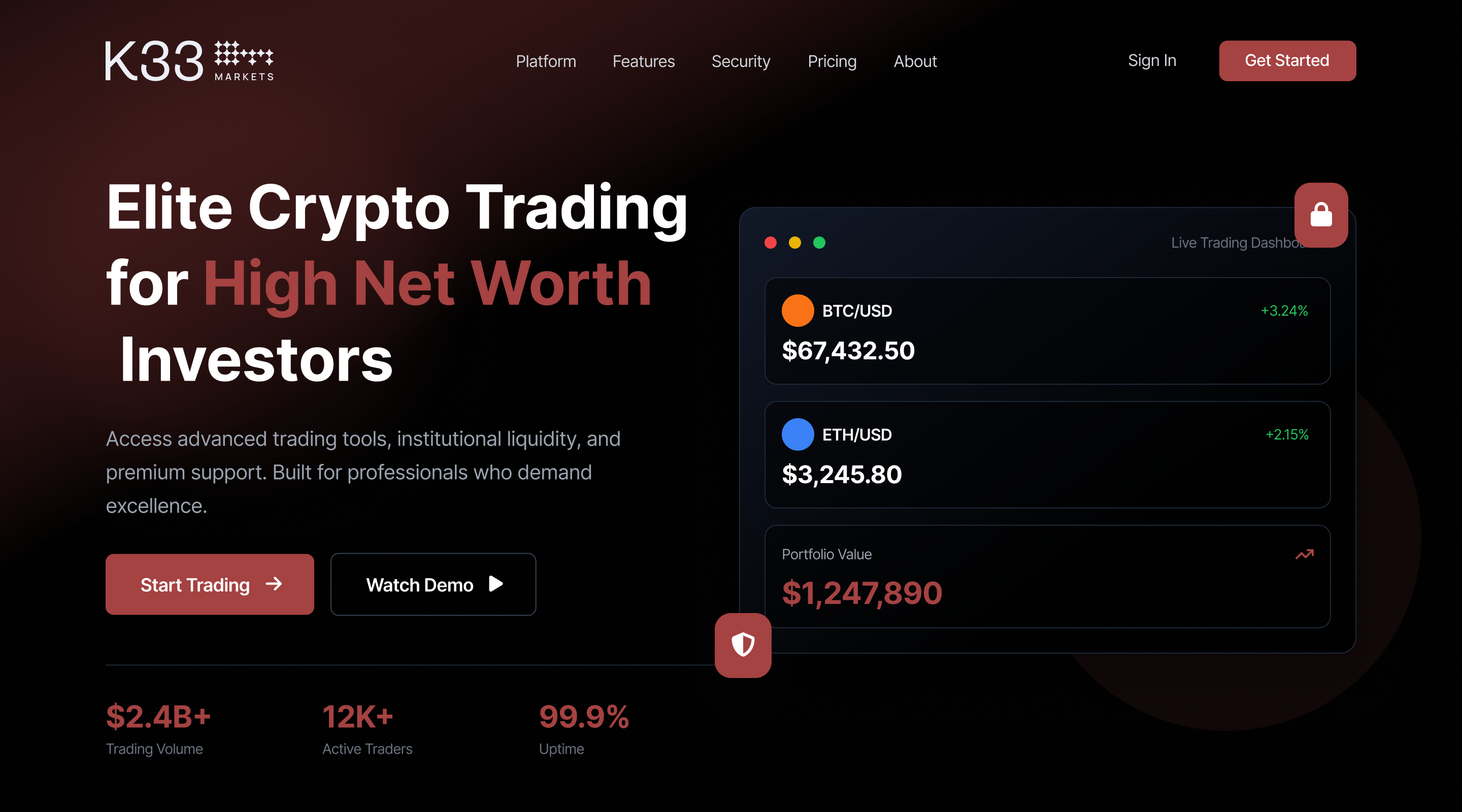
At K33 I led UX for a suite of crypto products that processed more than eighty million dollars. The challenge was to translate complex financial data into clear, immediately actionable signals, to build trust in a volatile market, and to raise conversion without adding friction. The work focused on onboarding clarity, information architecture, and subscription experience.

The platform offered valuable research, although trial to paid conversion remained low. New users struggled to see value quickly, the navigation leaned on jargon, and paywall messaging lacked clarity and trust signals. We needed to make the value proposition visible within minutes and to make the purchase decision feel safe and informed.
User interviews and diary studies revealed distinct motivations and blockers across beginners and professionals. Based on those insights I designed segmented onboarding. Beginners received a guided tour with a single recommended action, while professionals entered tools with advanced defaults already in place. I introduced trust cues including analyst profiles, freshness badges with explicit timestamps, and concise content summaries that highlighted what had changed since the last visit. I restructured the subscription flow with clear plan benefits, side by side comparison, and transparent pricing. The page architecture and component design were modular, which allowed rapid A B tests on copy, order of blocks, and the presentation of social proof.
One challenge: An initial redesign of the paywall made upgrades drop because the pricing looked overwhelming. We rolled back quickly, simplified the comparison table, and tested smaller trust markers first. This taught us that even small tweaks in financial contexts could create big swings in behavior.
Trial-to-paid conversion rose by 24% · 40% of users cited “clearer information” as a reason to upgrade · Time to first insight dropped from over 5 minutes to under 2 minutes
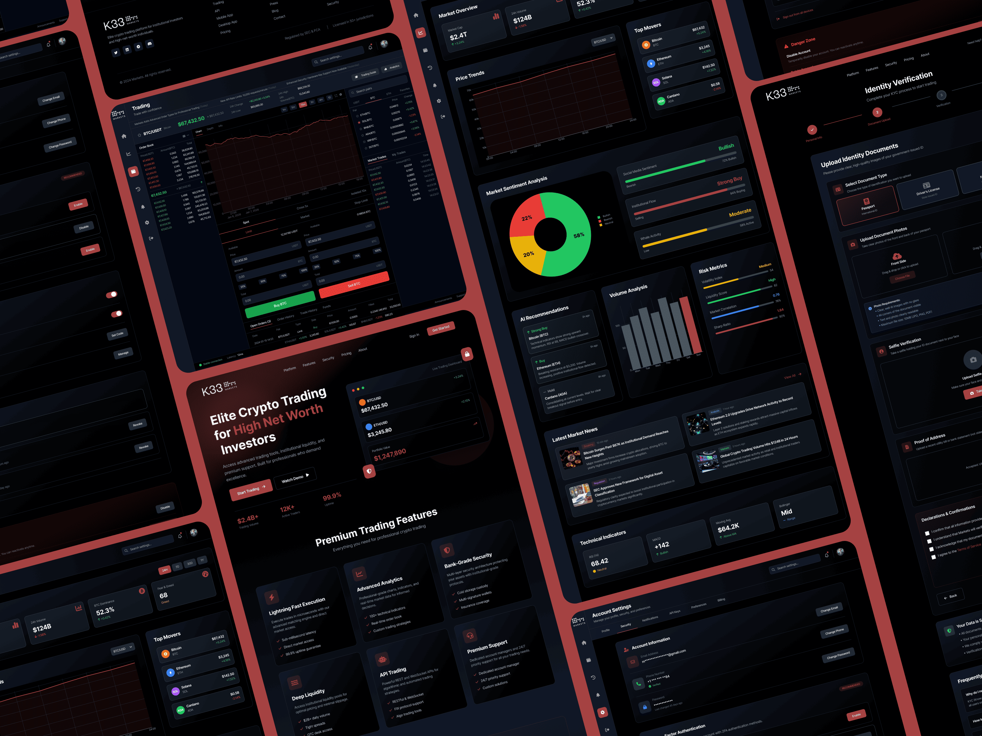
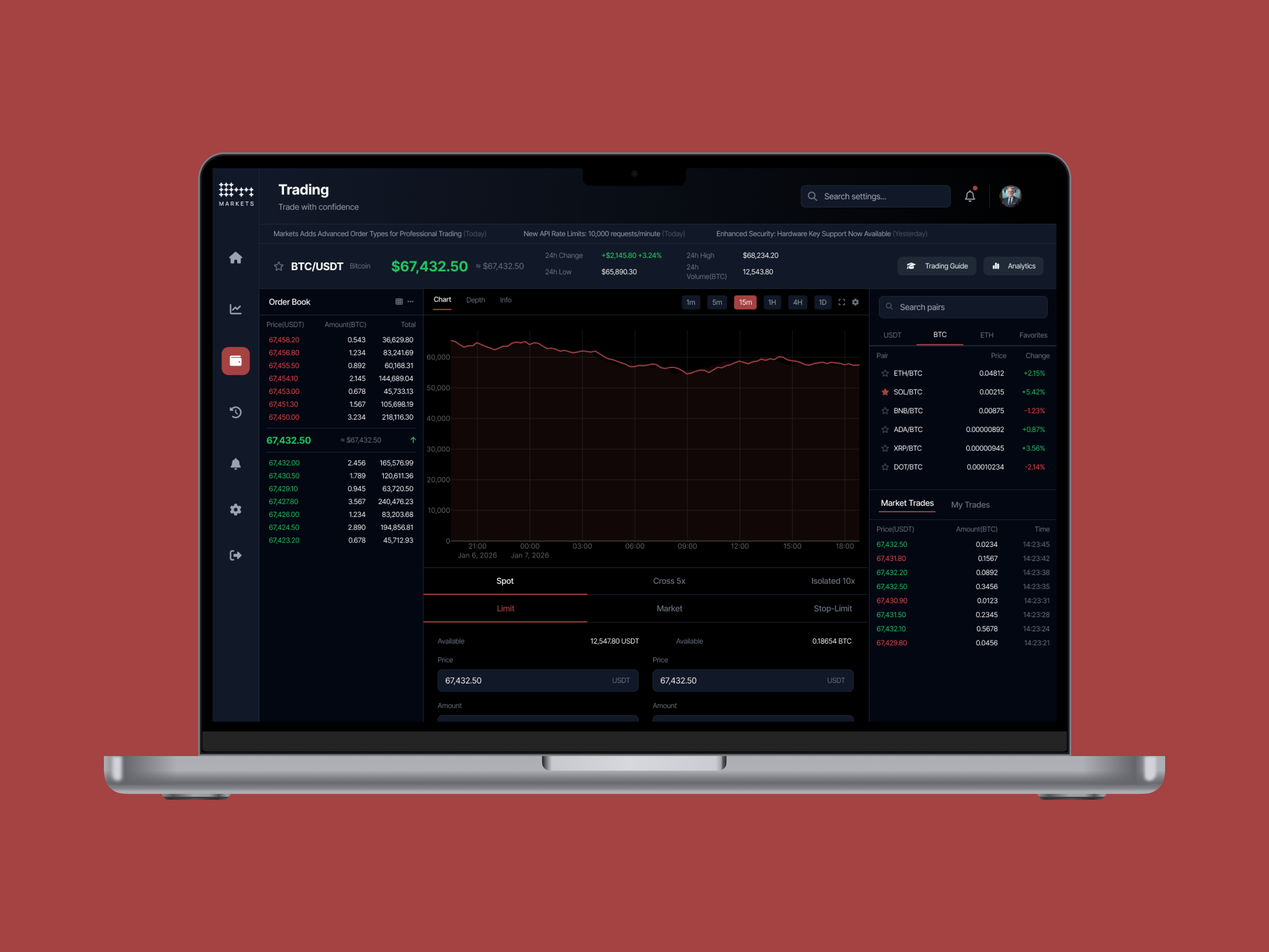
I created interactive prototypes for segmented onboarding and plan selection, established a navigation model with three layers overview, detail, and expert and launched a purchase experience with side by side comparison, short testimonials, and a simple money back policy. I ran controlled experiments over six weeks and defined a metric framework that tracked conversion, trial activation, time to first insight, and cohort retention.
A first version of the paywall reduced upgrades because the comparison table felt heavy. We reverted within twenty four hours, simplified the layout, and introduced smaller trust markers first. The adjustment preserved revenue while we learned. At the end of the cycle trial to paid conversion rose by twenty four percent overall, with beginners up thirty one percent and professionals up eighteen percent. Forty percent of purchasers cited clearer information as the reason for upgrading. Time to first insight dropped from more than five minutes to less than two. Sign up completion improved from sixty six to seventy eight percent, first month churn fell by nine percent for beginners, and net revenue per trial improved by seventeen percent in the following quarter.
The success of this redesign hinged on making the value proposition immediately visible and credible. By creating tailored onboarding flows for different user types and integrating trust markers, the product overcame its initial barrier of complexity.