Portfolio
Aug 2024
Clarity Under Pressure
Designing complex apps for specialized domains
Designing complex apps for specialized domains
At Protector Forsikring, I worked side by side with underwriters who make high value decisions under severe constraints. The legacy system combined power with friction. My focus was to reduce cognitive load and shorten the path to decisions while preserving the necessary depth of the tools. The work respected expert workflows and created clarity for new hires at the same time.
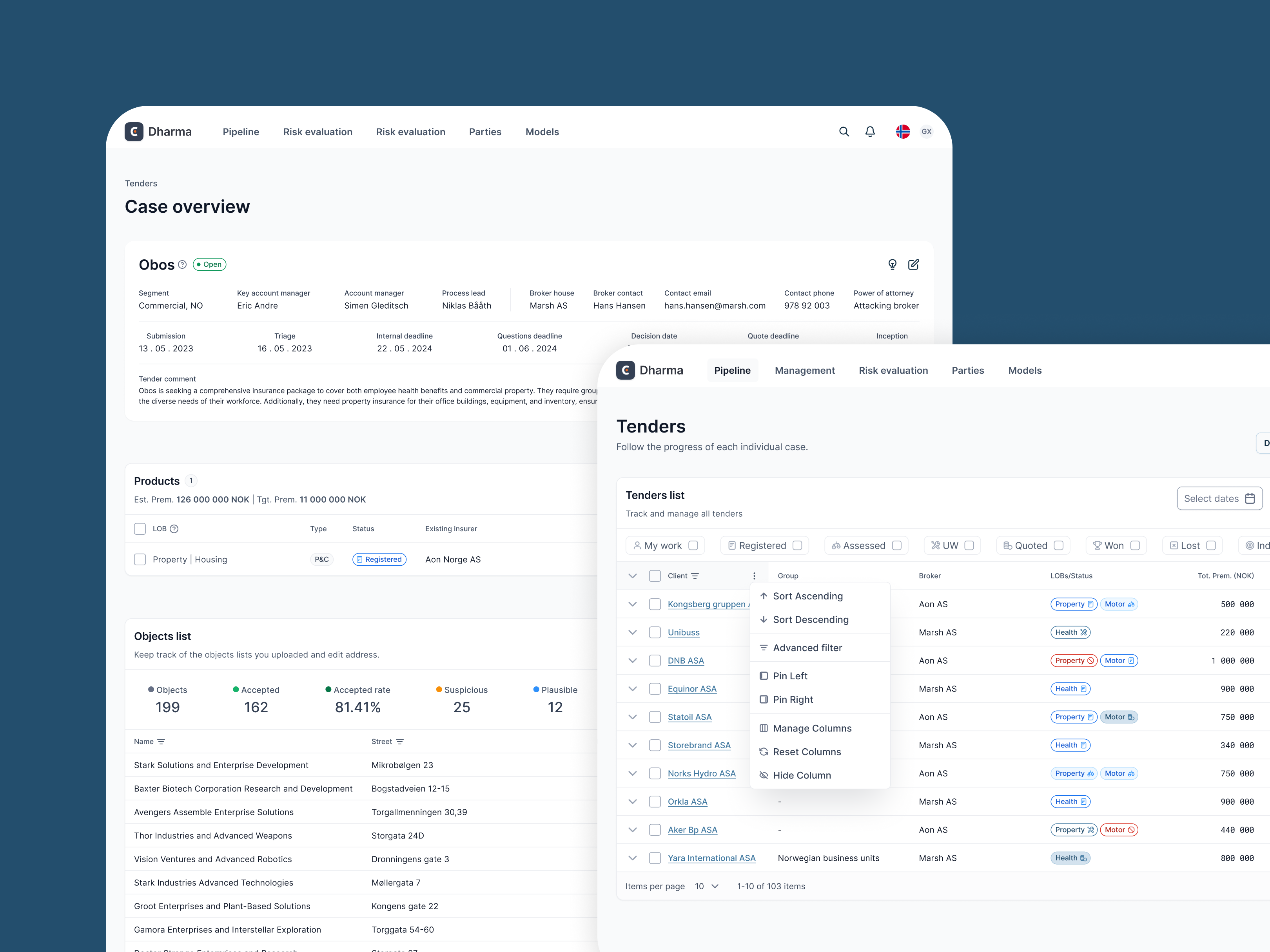
Screens were fragmented, terminology was inconsistent, and modal windows interrupted critical tasks. Error rates remained high, training required significant investment, and core flows took longer than they should. The system needed structure that reflected the way specialists actually think and work.
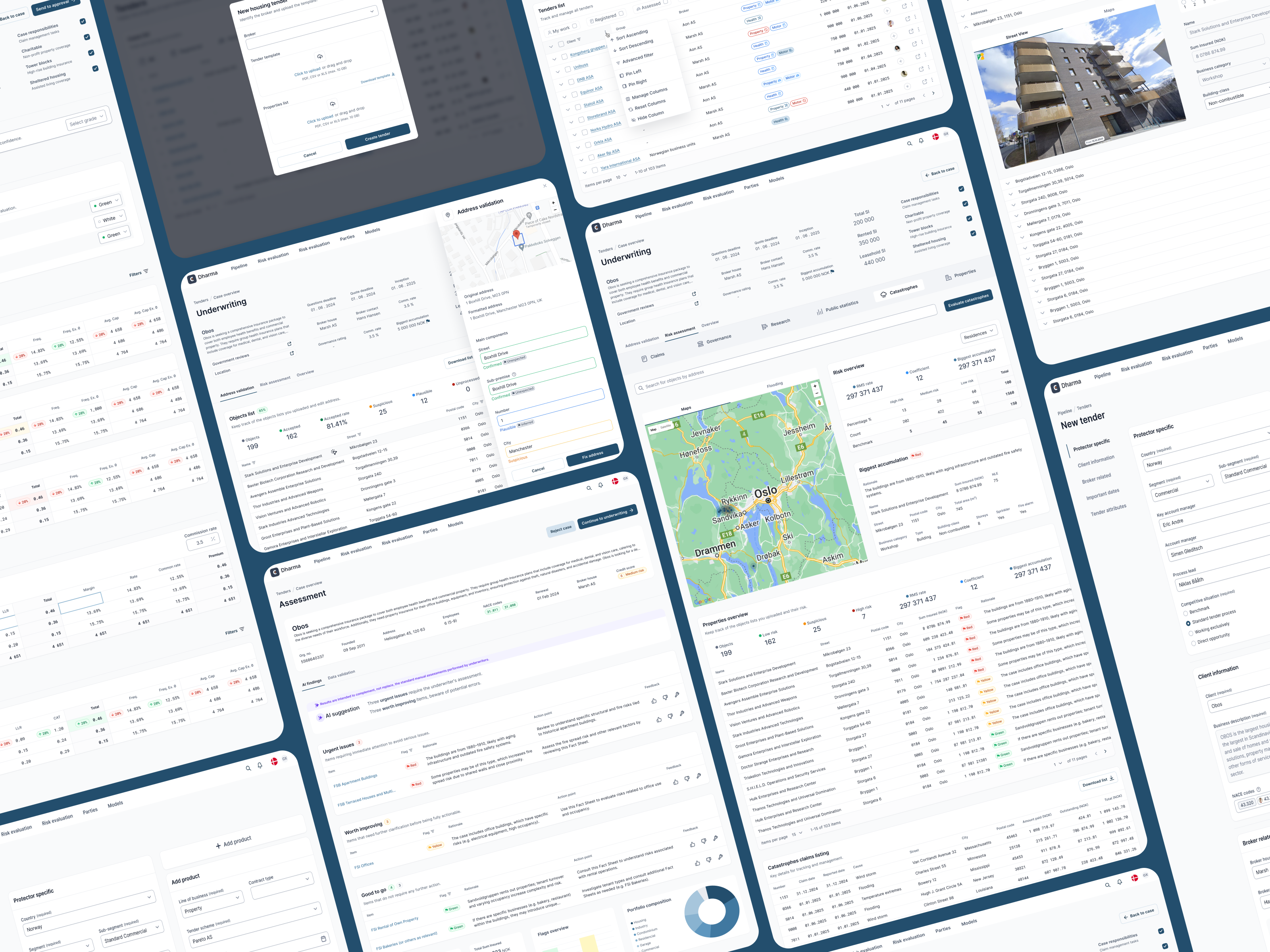
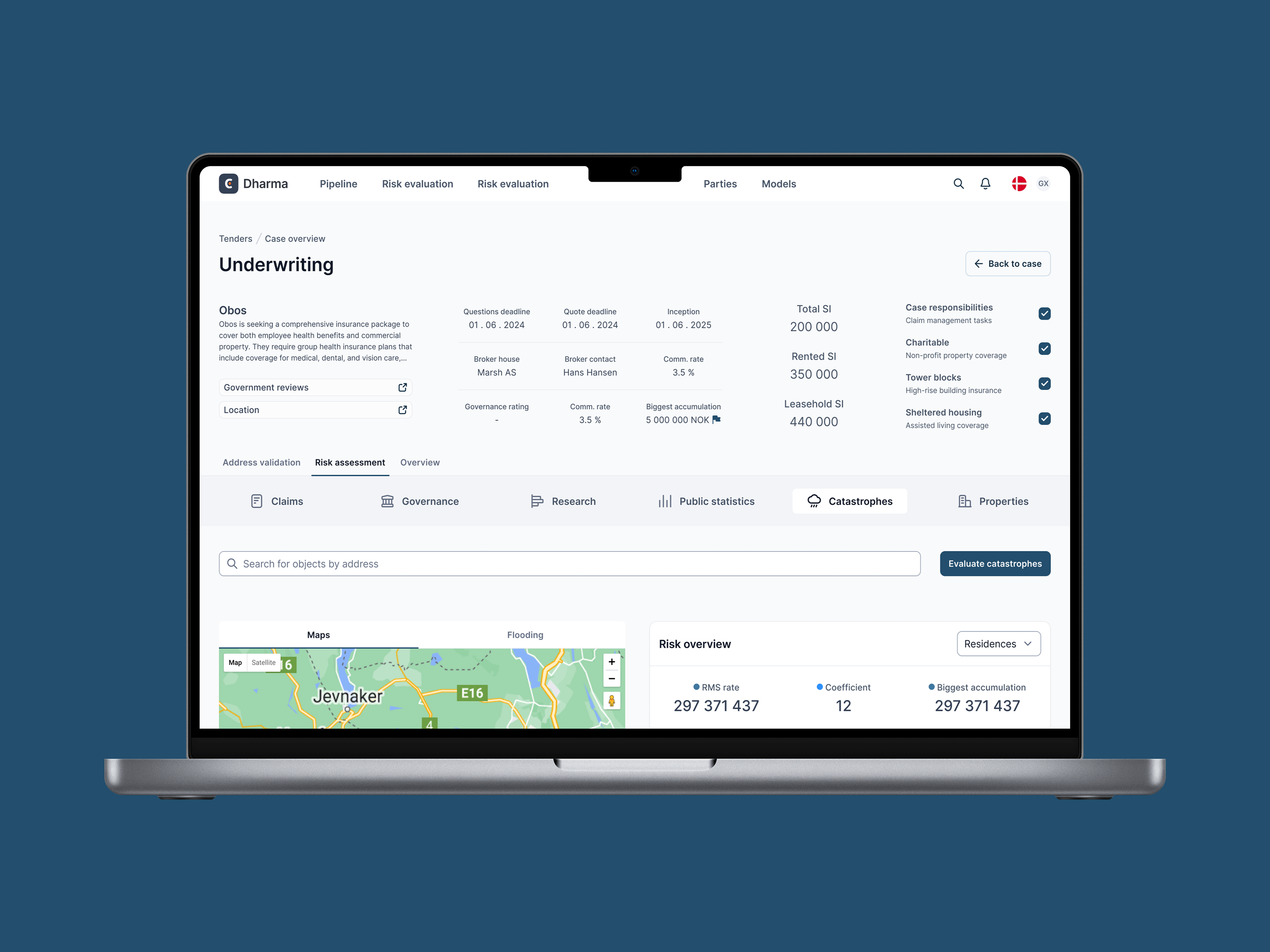
I mapped real workflows and interruptions through field observation and shadowing, then aligned labels with domain language through focused terminology workshops. I replaced multi step modals with inline editing and contextual side panels, introduced progressive disclosure for advanced tools and shortcuts, and added a unified search that covered policy, client, and document identifiers. I tested with new and experienced users and iterated between sessions so that each design decision reflected actual behavior.
One challenge: Experienced users resisted simplified terminology, seeing it as “dumbing down.” I hadto show how clarity reduced error rates, and once data supported it, even skeptics adopted it.
Task time shortened by 32% · Error rate dropped by 18% · New hire onboarding reduced by two weeks · Quality of data registered up to 85%
I produced journey maps for current and optimized flows and delivered high fidelity prototypes that reduced clicks and clarified navigation. I introduced an inline glossary with hover definitions and links to guidance and added validation messages that explained why inputs failed and how to fix them. I also designed an audit trail panel that allowed quick comparison of historical decisions without leaving the main screen. A Field Story: During shadowing an underwriter opened six screens to compare two policy versions. The new audit rail introduced a column compare and the same decision later happened on one screen in less than a minute. The same person told me the change saved the brain for the hard parts
Task time on the core underwriting flow shortened by thirty two percent and error rates dropped by eighteen percent on audited tasks. New hire onboarding time fell by two weeks because the glossary and inline guidance replaced a meaningful portion of classroom training. Search success improved by twenty six percent after the unified search release. Satisfaction climbed in surveys and interviews, and specialists said the interface finally respected their sequence of thinking.
By working directly with domain experts in their actual environments, this project ensured that the usability improvements were grounded in the realities of high-pressure workflows.